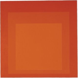
Josef Albers
Homage to the Square: Sentinel
born in Germany Oil on canvas mounted on Masonite 48 x 48 inches (121.9 x 121.9 cm) Gift of Society Bank 1986.15
Living Color
A leader in studies of color theory, Josef Albers devoted much of his career to examining color relationships. He created a series of paintings composed of squares, including Homage to the Square: Sentinel. His interest was not only in how one color placed next to another changes our perception of both, but in its physical and emotional associations as well.
A Day in the Life
What Do You See?
If Josef Albers was standing next to you right now and asked, “What do you see when you look at this?” what would you say? This happened to Estrellita Karsh, the widow of photographer Yousuf Karsh, and led to a surprising result. Find out more in the following video from the Museum of Fine Arts Boston. Then look back at Homage to the Square: Sentinel and consider what else you might see in it.
Transcript:
Albers was very famous as a teacher at Yale. His whole thing was the Homage to the Square. And this was a painting in shades of green, different shades of green squares. Albers said to me at one point, “What do you see when you look at this?” Contemporary art was really not my long suit, however, I did look at the painting, and it did conjure up certain images in my mind. And I said, “It’s as if you’re in a jungle, and it’s very hot and steamy, and you’re going through the foliage and suddenly you come upon a statue in a clearing and it’s a pagan statue of some god; it’s a great discovery.” And he put down his hands, I’ll never forget it, and he said, “The name of this painting is Steel and Foliage. The painting is yours. It was made for you.” I said, “Okay!" It is now one of the most precious things that I have because I loved him.
Tools and Techniques
Color is Relative
At Yale University, Albers did numerous experiments with color and he published the book Interaction of Color in 1963. He was interested in how colors change when they are placed in relation to other colors. For this reason, he is sometimes called the “Father of Modern Color Theory.” See a simplified version of some of his ideas in the following video by Richard Nelson, a one-time student of Albers.
Color Is Relative from Richard (Dick) Nelson on Vimeo.
Behind the Scenes
Look Closer
Color is Relative
Poll
Try to look at this painting for a full 60 seconds; let your eyes adjust to its values and just observe. After doing that, do you think Homage to the Square: Sentinel is...
Just for Kids
Signs & Symbols
Dig Deeper
Platters to Serve Color
Could you spend your life studying colors? Josef Albers did. In particular, he saw his Homage to the Square series as “platters to serve color,” a simple composition that enabled him to explore the dignity of individual colors and the way they come alive in relation to one another. Learn more about Albers work—including why his wife Anni did not want him to sell red paintings like this one—from Nicholas Fox Weber, Director of the Josef and Anni Albers Foundation, in the following video from the Henie Onstad Kunstsenter in Norway.
© Henie Onstad Kunstsenter, 2014
Transcript:
During his lifetime he was best known for the Homages to the Square, but he only began them when he was 62-years old in 1950. When you look at this drawing, you see many of the qualities you see in the work for which he’s been renowned his whole life: his ability to use minimal means for extraordinary effect. His ability to take one line, execute it meticulously, and echo his own profile so that you feel that you’re in the presence of a human head. And what is he doing? He’s evoking a subject. That’s what he did with color; that was his life-long belief, to honor the subject: color, line, animals, a human face, not to speak about himself.
We have here some of his very early works, very pure expressions of color. Please remember that he never painted a color on top of a color. If you feel that you’re looking at a form over a form and an effect of translucency or transparency, that is an illusion. What you’re really looking at here is always paint on a white background, paint on a white background. He taught students to find the middle-color so that you could create that illusion. And one reads this in many ways. At one moment there’s a form floating in front, at another there’s a sort of stage set going this way and that way; multiple things happen, and multiple readings are like the idea of midnight and noon at the same time: something impossible can occur in art, the imagination takes over, we’re no longer in the realm of pure science.
All of these paintings adhere to a very simple mathematical formula, in which you have a central square weighted toward the bottom of the painting, in an arrangement where whatever units you read underneath the central square are doubled to the left and right of it, and tripled above it. That arrangement creates movement in and out, back and forth, sideways, up and down. It creates a tension, a lack of resolution. The squares enabled him to let color have its voice. He called them his platters to serve color, because he could present any number of color climates, any number of juxtapositions, sometimes painting two paintings where the only difference between them is that one has at the center a Grumbacher Reilly’s Grey #8 and the other has a Windsor Newton Reilly’s Grey #8. It makes them different paintings emotionally, physically, and plastically.
We’re closing by looking at a group of his red paintings. Commercially, red is very popular at the moment. For the past two or three years the red paintings have been fetching twice the amount of money as paintings in other colors. One asks, “Why?” Part of it is that red has a particular impact on people. Part of it is that Anni Albers really prevented Josef from selling red paintings during his lifetime, because she considered red the color of love, the color of passion. She thought of the red paintings as Valentine’s to her—indeed, they were to a large degree. When you look at this group of red paintings, you’ll see squares come and go before your eyes. You’ll see colors evaporate into other colors. Josef told me with great pride that the photographer Cartier-Bresson said to him, “You paint circular squares.” By this he meant the corners disappear. Look at these paintings: corners disappear, light appears, and you enjoy the miracle of seeing.
Arts Intersected
The Sculpture Speaks
Did You Know?
Expert Opinion
Look Around
Putting on Paint
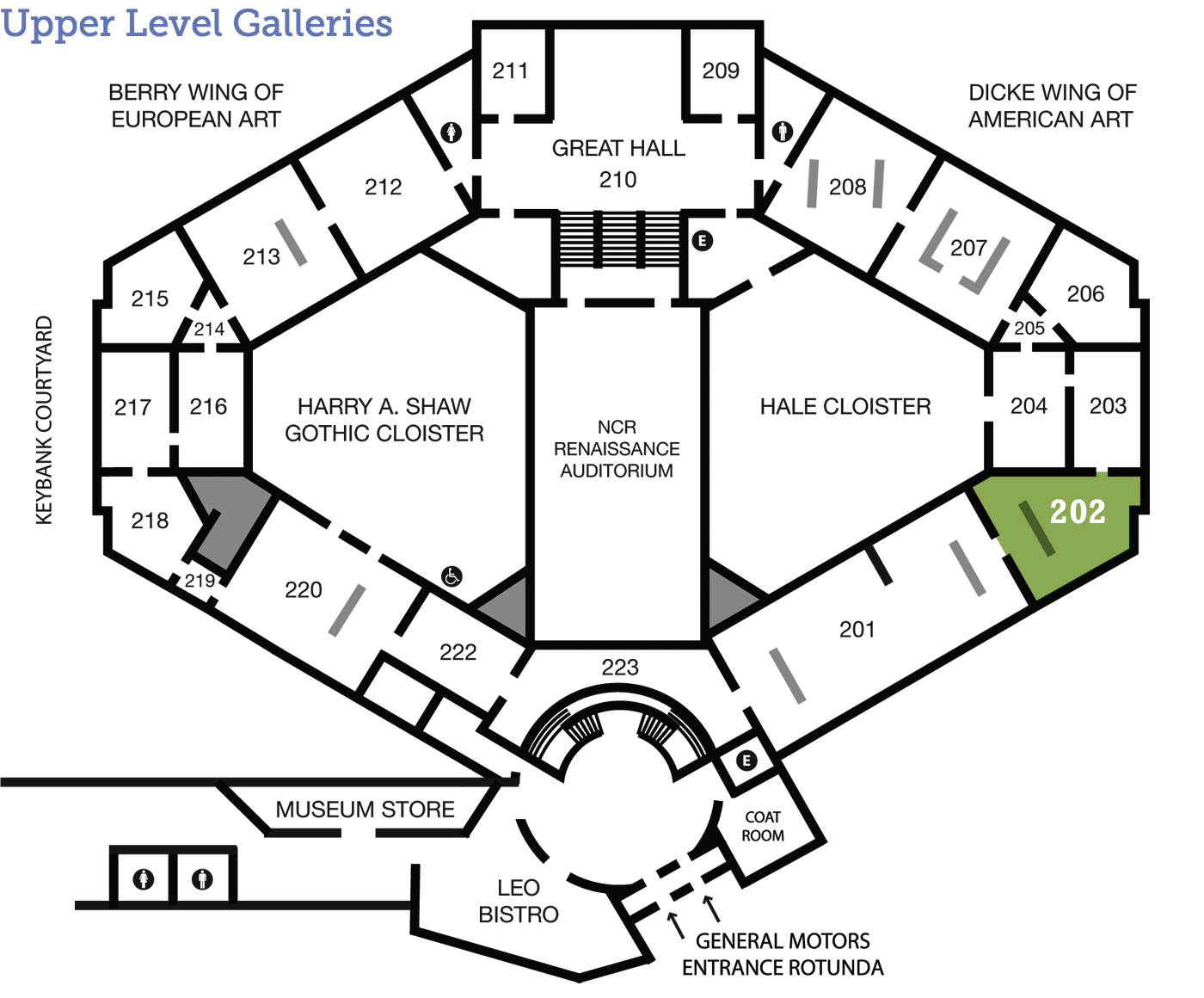
Look closer at the surface of this painting and notice the texture of the paint. Albers applied the paint with a palette knife instead of a brush, producing a flat, even surface. American artists in the mid-century experimented with applying paint in different ways to achieve different effects. Compare Homage to the Square: Sentinel with other paintings in Galleries 202 and 201, like Helen Frankenthaler’s Sea Change or Joan Mitchell’s Untitled. Frankenthaler used diluted paint applied in thin washes that stain the canvas whereas Mitchell used gestural brushstrokes that are applied in various thicknesses. Consider how these different ways of applying the paint affect how you look at the colors and the abstract designs in each.
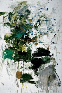
Joan Mitchell (American, 1925–1992), Untitled, c.1961, oil on canvas, 76 ½ x 51 inches. Gift of Mr. Max Pincus in honor of Mr. and Mrs. Elton F. MacDonald, 1964.25.

Helen Frankenthaler (American, 1928–2011), Sea Change, 1982, oil on canvas, 38 x 116 ½ inches. Museum purchase with funds provided by the 1987 and 1988 Associate Board Art Ball, 1987.53.
About the Artist
Instructions Included
Albers, as a theorist and educator, was eager to provide information to others about his processes and media. On the back of Homage to the Square: Sentinel he wrote information in detail on the base—six coats of white gesso—the paint colors—cadmium scarlet, cadmium red light, and cadmium red extra pale “all in one primary coat directly from the tube”—and the varnish. He also included the brand names he used—such as Windsor Newton and Rembrandt—as there could be subtle differences in each.
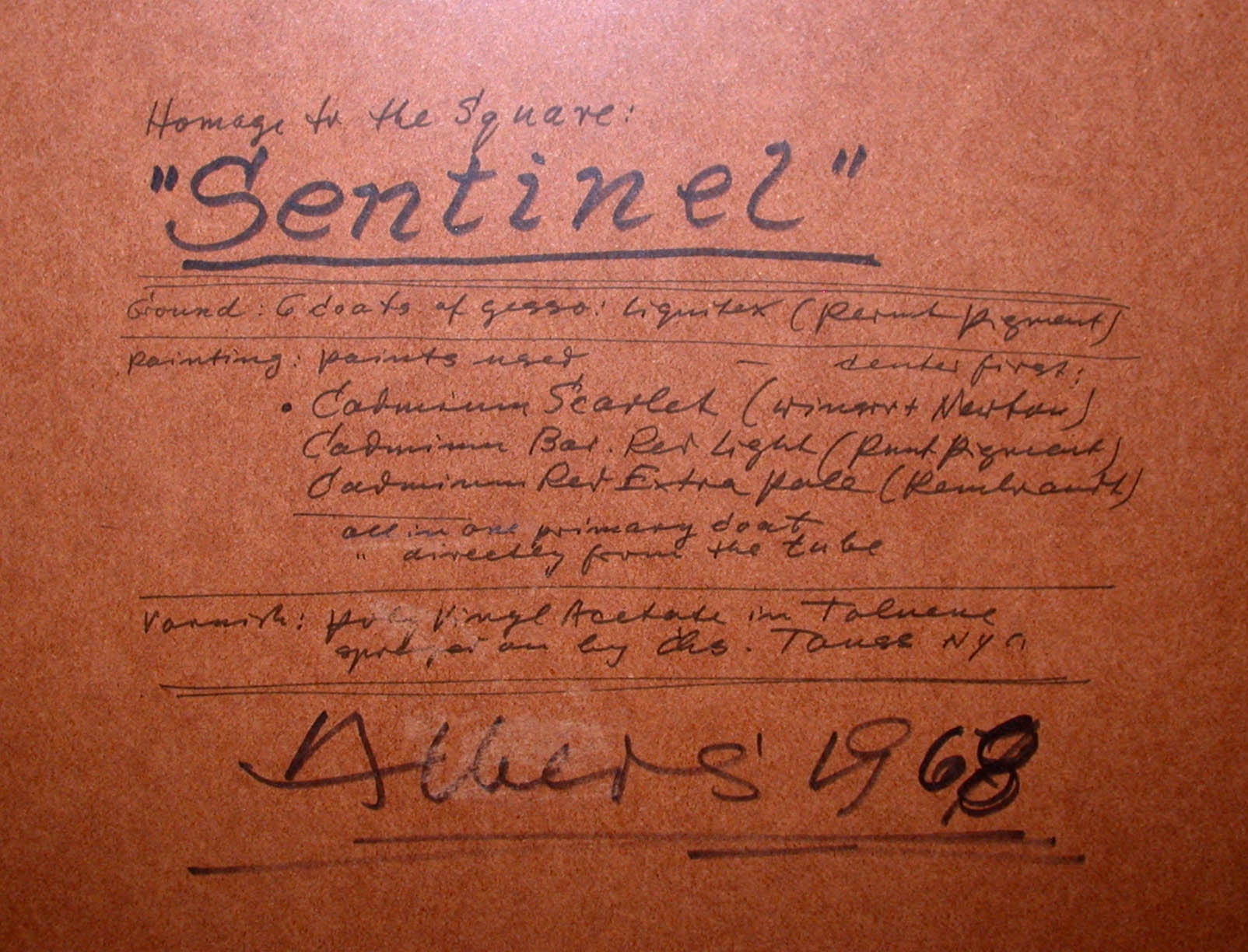
Detail, back
Talk Back
Watch Out
This painting is one of Albers’ series Homage to the Square and its title is Sentinel. A sentinel is another word for a sentry, one who stands guard or on watch, usually a soldier. Have you heard this word used before? What was the context? Does this title affect how you look at the painting? How would your experience of it change if it had a different title?
